Rita El Khoury / Android Authority
A couple of weeks ago, Google Maps started rolling out improvements to the transit experience in many cities, including Paris where I live. I was quite excited to discover the new features until I realized they’ve been live for me but I didn’t notice them — that’s how minor these changes are.
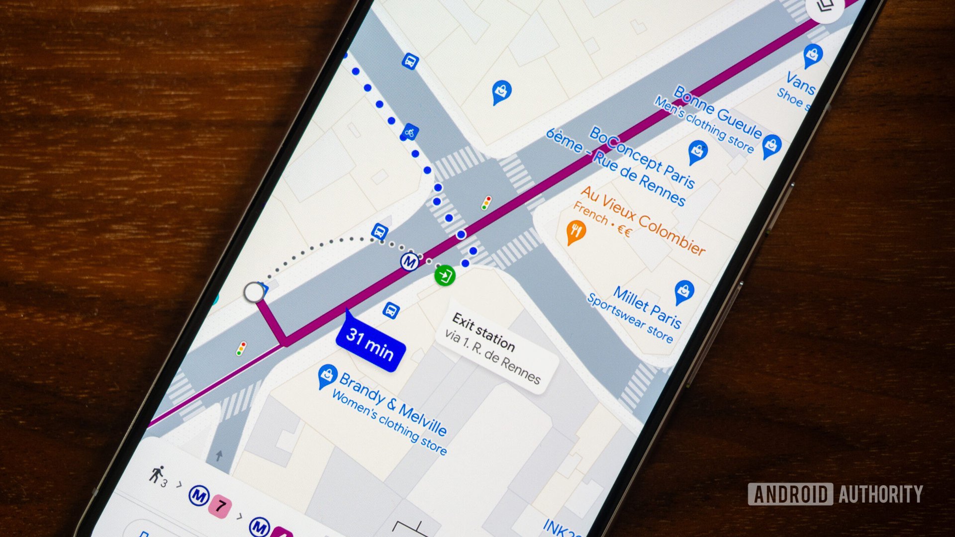
In short, there are two improvements to transit directions in Google Maps: station exits and entrances and route options. The former lets me see which side of the road I have to go in/out of, while the latter allows me to set route preferences with less walking or fewer correspondences.
These are good changes, certainly, but as someone who has spent the last two and a half years carless and exclusively taking public transport, these count as the most minor changes on the list of improvements I’d wish Google Maps would introduce.
My personal experience with Google Maps transit veers between “fine” and “frustrating” on a good day. It all starts with the fact that transit directions don’t show up on my Pixel Watch 2, for some reason, and I have to keep looking at my phone. Or switch to Citymapper if I want my train and bus directions to pop up on my wrist. I don’t know why transit is treated as a second-rate citizen in Google Maps on Wear OS — perhaps those rich enough to buy a smartwatch don’t take buses, ha?!
Then there’s everything to do with transit directions. Any associated walking is treated as dots on the map, period. There’s no turn-by-turn navigation, the map doesn’t flip while I walk, and I have to keep glancing down at my phone to make sure I haven’t missed a turn or gone off in the wrong direction before reaching my station or destination. Worse yet, I have no idea if the walk is manageable or if it’s pure uphill or downhill before picking it. Should I manually find the elevation of my starting and end points to get an idea? And why doesn’t Maps treat transit plus walking as a mixed-mode navigation, to offer the best of both?
Plus, Google Maps doesn’t calculate how long it takes to enter the station and get to the train track, or exit it. Some stations are huge and require a few minutes of walking — time that isn’t calculated or shown in Maps. There is no info on escalators, stairs, or lifts, and no indicators for more accessible exits or correspondences.
Things get even more complicated when you dive into the weeds of daily transit usage. If the route I’ve picked offers a few different bus or tram line options (i.e. they both go from A to B, but through different tracks), I only see the stops of the bus or tram that Maps thinks I took, even if I’m on the other track option. I noticed this a lot in Prague, where I kept getting confused thinking I missed my stop or jumped on the wrong tram, only to realize Maps was showing me the alternative line’s stops.
Worse was my experience in a few cities where Maps, for some reason, kept ignoring the nearest (in time) train or bus, and offering the one after. Even if I was already at the station and the next bus was scheduled in four minutes and the one after in 10 minutes, I’d see the 10-minute bus as the default option. This messed up all my correspondence timings and recommendations. I had to start setting manual departure times five minutes earlier to get the right directions.
All of these, and more, are issues that Maps has to figure out with transit directions to make life easier for the millions of people and billions of trips that people take every day. Yes, entrance and exit stations are cool, but the experience is still severely lacking in many other aspects.


