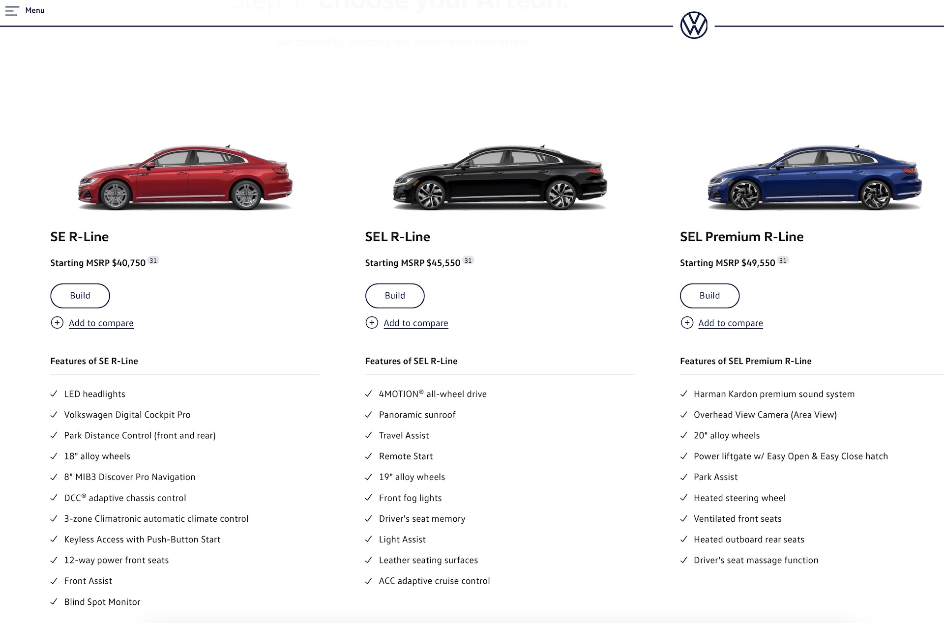
Bought a new car lately, or done some four-wheel window shopping online? Then you’ll have noticed that some automakers’ retail websites absolutely suck.
We can’t be the only ones who find some of them hard to navigate and too concerned about looking slick and giving you superficial vignettes of the fantasy life you could have with their car instead of giving you easy access to the information you need to decide whether you actually want to buy the car or not.
Far too many of them have fancy panes sliding in and out, embedded videos that impart almost no useful information, and are punctuated with glossy, airbrushed pictures accompanied with superficial marketing waffle that tells you nothing. I approach those “Explore” buttons with dread because you know that as soon as you click you’re going to be sent down a vacuous promotional rabbit hole that’s the website equivalent of one of those snaking pathways through the tax-free cigarettes, perfume and alcohol sections at an airport.
Some sites’ configurators offer next to no meaningful description of an option that might sound totally unfamiliar, despite giving you a pop-up box that’s supposed to help you out. But my biggest gripe is how difficult it can be to find a simple old fashioned table showing the technical spec and standard (and optional) equipment fitted to a car, and better still, a table that compares the different trim grades. It’s the sort of thing you used to get in a printed brochure, and can still sometimes get if you can find a digital brochure to download.
Related: 40 Years Worth Of Automotive Brochures Helps Japanese Police Solve Crimes

Now I appreciate that your average mom looking for a new car isn’t going to be annoyed that she can’t find the corresponding engine rpm figure for peak torque in a hybrid minivan. But some of us do care about that stuff because we want to be able to compare the specs of rival cars.
Volkswagen, on the other hand, takes things to extremes, even giving you the individual gear ratios for its cars, which is pretty niche in 2022: “You know Marg, I was looking at that Jetta, but I just got off the VW website and it turns out it’s running a 1.47:1 fourth gear, so amma thinking we’ll go for the Camry instead.” Not even Porsche gives you that kind of info.
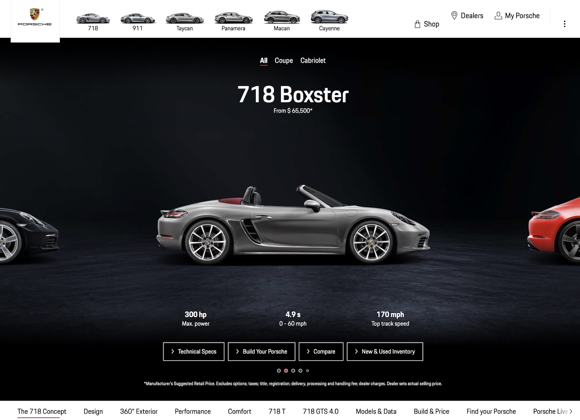
Overall though, Porsche’s website is a good one, in our opinion. It’s logically laid out, the homepage displaying one image of each model accompanied by one button to go to the configurator, and another to find out more about the car. Click the button to find out more about a model, for example, the 718 Boxster, and you can then slide sideways through the different trim grades, each one receiving an appropriate profile picture accompanied by a price, a power rating and performance stats, though if we’re being picky, an mpg number would be more useful than a top speed figure.
And if you want to dive into the proper technical specs, which car guys tend to want to do, you press a simple, easily-found button marked “technical specs” and you get a full break down of power and torque figures, economy numbers and dimensions. The only real snag with Porsche’s site is that the cars are so expensive the majority of car buyers won’t get to benefit.
So why do some other automakers make such a mess of the same task? Which brands websites do you find useful and easy to navigate, and which might as well be displayed in raw HTML, rather than just being coded in it? Leave a comment and let us know.


