<!—->
Buick’s fancy new logo started out life as part of an incomplete sketch that caught Mark Reuss’ eye
6 hours ago
 –>
–> 
by Sebastien Bell
–>
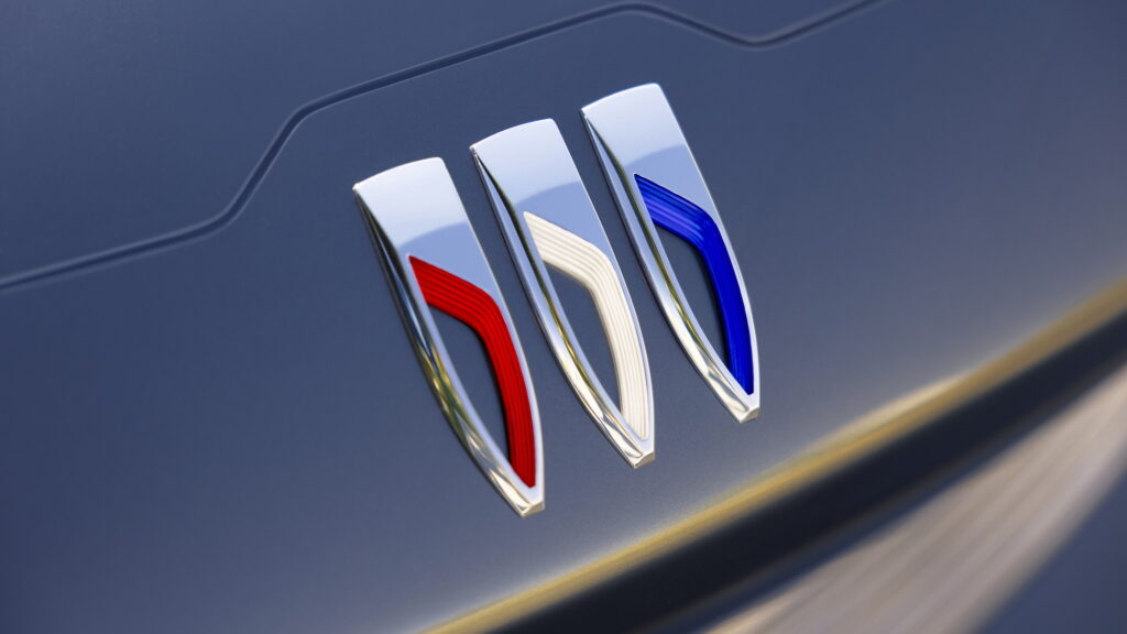
When it announced that it would be transitioning to manufacturing only electric vehicles by 2030, Buick did something that a lot of other automakers have done, and introduced a new brand identity, with a simplified logo to go with it. But the decision to change its logo started out independently of those electric ambitions.
As Bob Ross might have said, the new logo, and the subsequent reshaped brand identity, were a “happy accident.” A feature of an incomplete sketch that slipped through the cracks and accidentally found its way into the hands of GM President Mark Reuss, no one was expecting the logo to change so dramatically, reports Automotive News.
According to Steve McCabe, Buick’s advanced design manager, the sketch was drawn by Geoffrey Richmond as part of an assignment that was intended to come up with a new face of Buick.
Read: Buick Commits To EV-Only Future And Confirms Electra Name For EVs
Richmond’s sketch was an early iteration that, like other sketches, featured only rough lines that were intended to be filled in later. The traditional Buick badge had not yet been placed on it, as was intended, and instead, it only had a few swooping slash marks on the hood. Reuss apparently saw the design, though, and liked it.
“This one just happened to be the one that sort of slipped through without us putting a badge on. And when [Reuss] saw that, he was intrigued by it,” said Richmond. “The fact that it was just my sketch was just a happy accident. I mean, everybody in the studio was doing these kind of sketches.”
advertisement scroll to continue
That ultimately led the brand to redesign its badge, rearranging the three shields in a straight, horizontal line, rather than diagonally. The circle that surrounds the shields was also removed, something that has been a part of Buick’s design language since 1959. Reuss said, though, that the new logo will serve the brand well as it makes the massive change from engines to electric motors.
“The redesigned columns of the tri-shield incorporate fluid movements that convey motion,” Reuss said. “It’s sleek and dynamic, and I love that we’ll see it on all Buicks going forward into the new era of electrification for the brand and for the company.”
According to David Haskell, a creative designer at Buick who helped refine the new logo, the change actually has a bigger impact than you might expect.
“You’re designing this brand-new face and it’s super modern, and from the studio’s perspective, then you put the sort of old badge back on it, it sort of dates everything,” McCabe said. “It all ties in. It’s all part of the bigger story of what we’re trying to do with the brand overall.”
 –>
–> 