
Porsche introduced its famous hood crest in 1952 but it was almost replaced a decade later and Porsche’s museum archives still contain the rejected designs
https://www.carscoops.com/author/chris-chilton-cc/
 <!–
<!– –>
–>
by Chris Chilton
12 hours ago
 –>
–> 
–>
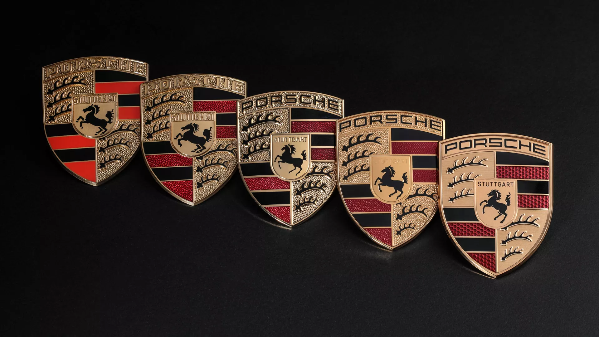
Porsche revealed a nipped and tucked version of its famous crest earlier this year, the fruit of a scarcely believable three-year project that resulted in a badge that to most people looks almost exactly the same as the old badge, just a bit less shiny.
But that’s understandable. Although many automakers have revised their logos and badges in the past couple of years, the brands with the really recognisable badges, badges that are part of the fabric of the firm – VW, Audi, Porsche, Ferrari – tend not to mess too much with the formula.
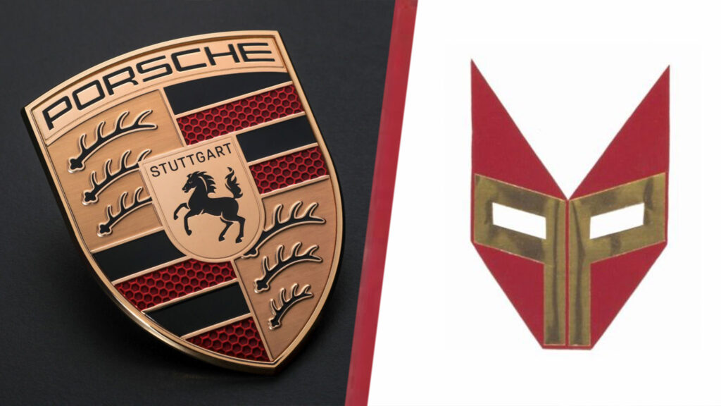
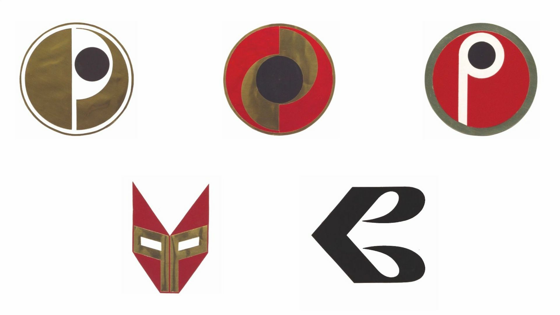
So it comes as a shock to learn that in the early 1960s Porsche considered replacing its iconic crest with a new badge that looked nothing like it. Archivists at the Porsche Museum have dug out some of the proposals and beyond a couple of them featuring a stylized letter ‘P’ and some red and gold coloring, there’s nothing to connect them to the Porsche badge we know and love. One of them even looks disturbingly like a Transformer head.
advertisement scroll to continue
But why did Porsche think it needed a new badge only eight or nine years after introducing one that had become so recognizeable on the hoods of the company’s cars? Much of it comes down to the limited technology of the time. Making the badges wasn’t the problem, but reproducing them in printed material was because color printing was still relatively rare and expensive in the late 1950s and early 1960s. And the multi-color crest didn’t stand out well in black and white.
Related: Porsche Facelifts Iconic Crest For 75th Anniversary, Can You Tell?
Some Porsche dealers and sales managers also thought the original design was too busy to work on a road car. “The different colours and many details as a whole do not amount to a compact, coherent visual effect in road traffic,” they wrote in a letter to Porsche and its head of advertising, Hermann Lapper, in 1961.
The Mercedes three-pointed star and VW logo, the latter designed by Franz Xaver Reimspieß, the man responsible for the Porsche crest, were held up as good examples of great design, and commercial artist Hans Lohrer was commissioned to produce a selection of alternatives. The plan was for the winning design to make its debut on the successor to the 356, the 911.
Fortunately for us, Porsche decided not to greenlight the badge change after all. The exact reason is unknown but company archivists think bosses might have reasoned that junking a logo that had been in use for 10 years wasn’t such a great idea after all. And although the crest has been through a couple of light facelifts since, it’s still at heart the same badge first seen on the 356 more than seven decades ago.
